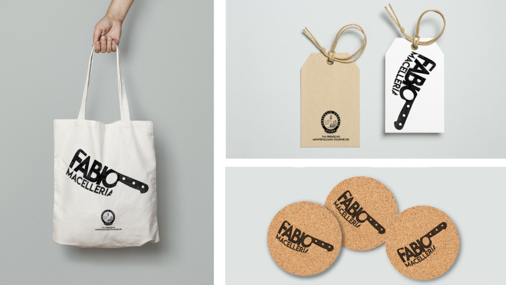
This project born spontaneously when Fabio, my dad, asks me to realize his business cards using his old logo. I decide to gave a modern feeling and to create a brand solidly connected to his business.
I started from a solid base: he runs a traditional butcher shop in the heart of Tuscany, what’s more typical than this?
The logo is made using positive and negative space, using the wordmark to recreate one of his main tools: a cleaver. Using a tool, instead of just showing meats would like to enlighten the master of the artisan, more than just the meat. Craft on which my dad has worked for about 40 years, and it’s what makes his butcher shop differente from the others.unspla


More than developing a real brand identity, in this case, I worked more on the immediacy of the logo, I wanted to create something easily recognizable by the addressed target of the shop, made mostly by older people.
When the target change, like in the video below, even the way to communicate changes. I realized a commercial to be shown on TV at Live Rock Festival, it should be eye-catching, fast, and different from all the other ones. I created this commercial, inspired by Apple – Don’t Blink spot.

